Oops!
Oops!
Oops!
Dashboard With Sales Data Visualization
Data Visualization on Car Sales, an In-depth Analysis

Tool Used: Tableau, Google Sheets
Team: 1 Person Project in Info Viz Class in Fall 2021
Background & Problem
In our Information Visualization class in fall 202, I worked on a Kaggle dataset corresponding to car sales between 2003 - 2005. Comprehending the raw data and distilling meaningful information from it is important to gain insights.
Solution
I created a data visualization dashboard that takes raw data, and creates visual representation that is intuitive, fast, and effective. The dashboard is easier for humans to identify trends, patterns, and outliers.
My Process
I started with CSV file containing raw data

Analysed the data
I analyzed the datasets and visualized them the following ways:
Sub-selection: Visualizing the distribution of sales
Comparison: The sales of classic cars vs. motorcycles over several quarters.
Pie Chart: Percentage of Classic Cars by Geographic Region.
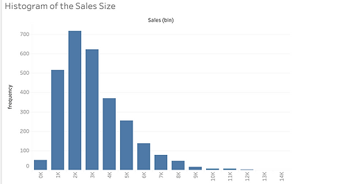
Univariate analysis: Histograms of the quantity ordered, per item price, and sales size
Animation: Animated visualization of time series/historical data.
Created Tableau dashboard

Description of the Project
I used Tableau as a tool as it can help anyone see and understand data with intuitive, visual analytics.
The open-source Kaggle competition dataset which represents samples of sales data for vehicles and airplanes. It has details of the orders, such as the product line, numbers ordered, sales revenue, geographical segment, time of order (day, quarter, and year).
Details of the Project
Our visualization tasks will cover the following key points:

Sub Selection
Visualizing the distribution of sales over a particular product over different quarters and years; distribution of sales of all products over different geographical segments; visualization of sales over different product lines as a function of the geographical segments.


Grouping
The sales of motorcycles and classic cars together over a period of time.

Compare
The sales of classic cars vs. motorcycles over several quarters.


Analyzing the KPIs
KPI of orders and customers data such as annual sales, monthly sales, monthly active customers and comparison of orders with respect to geographic location and deal type.


Univariate Analysis
Histograms of quantity ordered, per item price, and sales size


Animation
Animated visualization of time series/historical data
Final Data Visualization Dashboard
